Trends to Watch
BY MEGHA ANN MATHEW
22 July, 2025
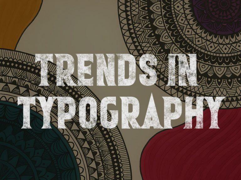
Typography-forward designs are having a moment. Titles rendered in custom letterforms or hand-lettered scripts are now a familiar sight. This trend reflects a global movement but takes on unique significance in India where scripts like Devanagari, Malayalam, Tamil, Bengali, Urdu, etc, carry deep cultural and aesthetic weight. Covers with bilingual or dual-script titles are also rising, acknowledging both India’s multilingual readership and the visual richness of regional scripts.
Hand-drawn and illustrated covers are also back in vogue. Whether it’s the delicate pen work on literary novels or the bold gouache palettes on YA titles, illustration is being used to express everything from nostalgia to disruption. Indie designers are drawing from miniature paintings, street art, pop culture, and protest visuals to create a language of cover art that is uniquely Indian yet globally resonant.
Cultural motifs such as rangoli patterns, local textiles, classical temple architecture, chai glasses, scooters, and tropical flora, are being reinterpreted not as clichés but as dynamic visual cues. They help anchor a book in a specific cultural context while making it visually rich and immediately recognisable.
Behind the Scenes
A great cover is rarely an accident. It is the product of conversation, often spirited, sometimes chaotic, between author, editor, designer, and marketing team. In Indian publishing, this process is evolving. Publishers are no longer outsourcing design as a checklist task. Many now have in-house design teams or work closely with freelance artists from the concept stage itself.

Take the example of Derrida in JNU by Nigitha John, published by Magic Moon. The book’s striking cover, a bold reinterpretation of the Mona Lisa rendered in mosaic-like blocks, overlaid with South Asian and postmodern motifs, perfectly captures the novel’s spirit of philosophical play and cultural fusion. It’s a visual nod to both classical art and the layered, fragmented aesthetic of post-structuralist thought. Developed through multiple rounds of collaboration between the author, an illustrator, and the publisher’s editorial team, the cover blends sharp design with conceptual depth, making it not just a protective shell, but an extension of the story’s intellect and imagination.
Covers as Digital Currency
In a landscape where book promotions increasingly rely on digital buzz, a cover can be a campaign’s strongest asset. Publishers now reveal covers like film trailers. They’re teased in advance, launched with influencer collaborations, and often turned into animated snippets for Instagram and YouTube. A striking design invites engagement—reposts, reviews, memes, and even fan art.
Online platforms like Amazon and Flipkart also give disproportionate visual real estate to the book cover. A good thumbnail can lead to higher click-throughs. Similarly, in physical bookstores, readers scan shelves at speed. A bold spine or intriguing texture can halt that scan.
The shift has also been democratising. Emerging authors, who might struggle for mainstream attention, can gain traction if their cover captures the imagination. A good design levels the playing field, sometimes even overturning it.